Brief
Oiapok is a modern future jazz / rock progressive band focused around nature and human explorations. I teamed up with the main singer (which has a design degree) which gave me useful feedbacks about the identity of the band.
Challenge
We wanted to upgrade the identity of the band, as it changed its name and its art direction for a more serious and engaged approach.
Thi idea was to convey a deep sense of ecology and poetry in the visual communication. As the name is inspired by the « Oyapock river » and a stellar ring named « Oiapoque », the universe should be mysterious enough to convey both a natural and galactic feel, like if we were on another planet.
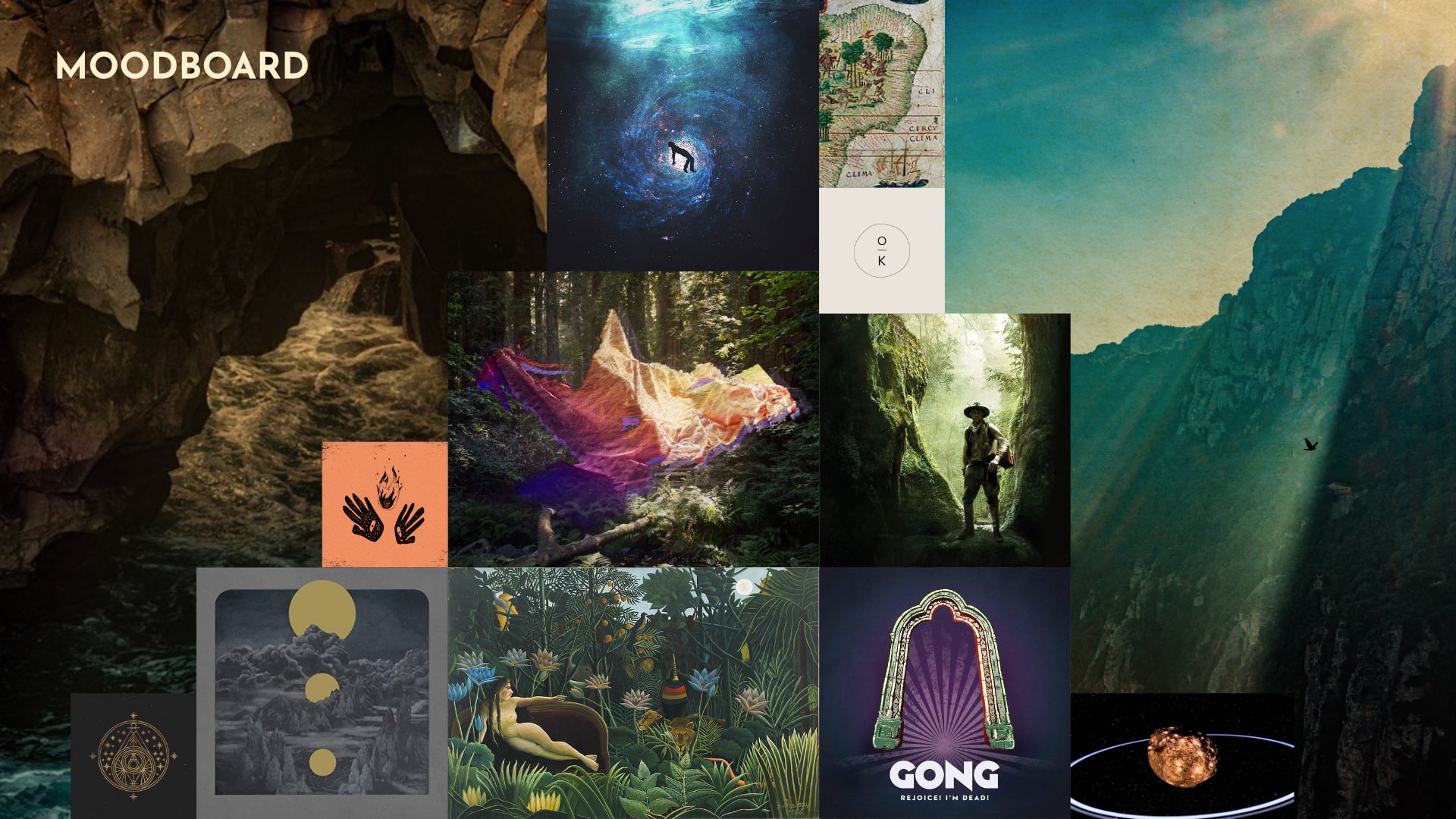
We began to collect a tremendous amount of inspiring pictures, textures, typographies and logotypes that we thought that they were fitting into the Oiapok universe, then we made a closer selection of some of this images and made a first moodboard with it.
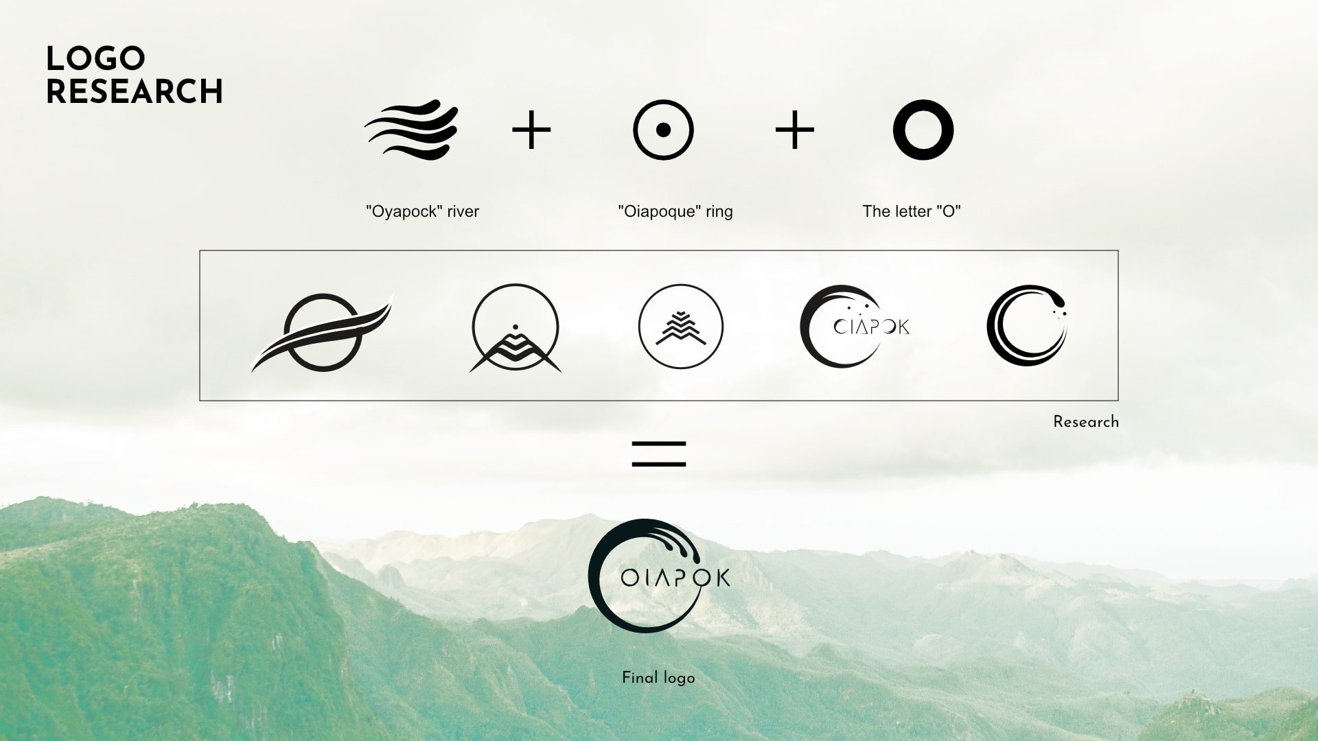
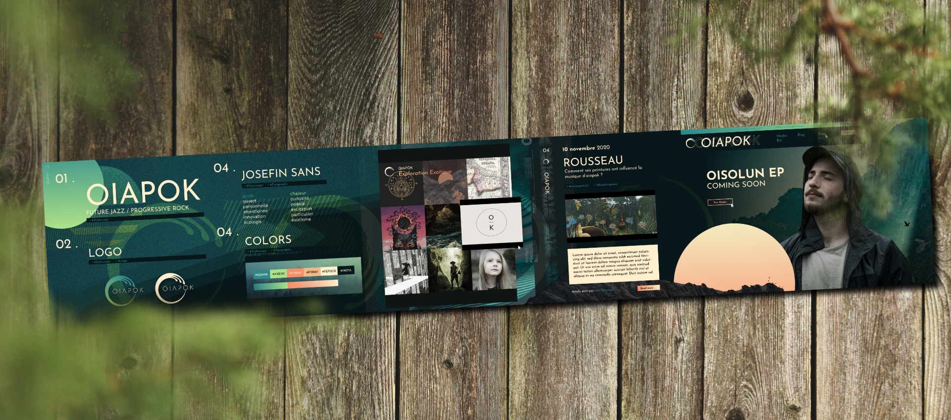
The logo is a combination of the symbols of the Oiapok universe : the river, the stellar ring and the letter « O ». The typography used in the logo has a simple handwriting feel that gives the logo kind of a tribal spirit.
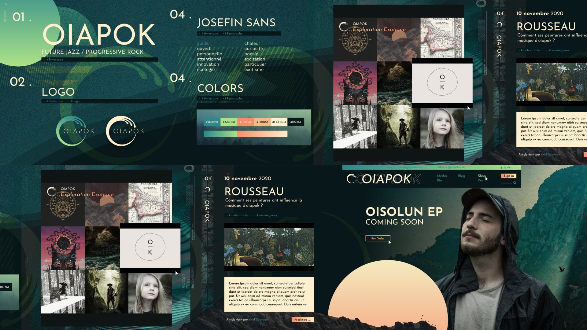
After the logo, I built an entire stylescape to define the color palette, the tipography, some interface elements, the moodboard, the overall ambiance of the brand and a first type of persona. This will become the primary guide for all the visual communication of the band.
Thank you !
Website @ oiapok.com
