Brief
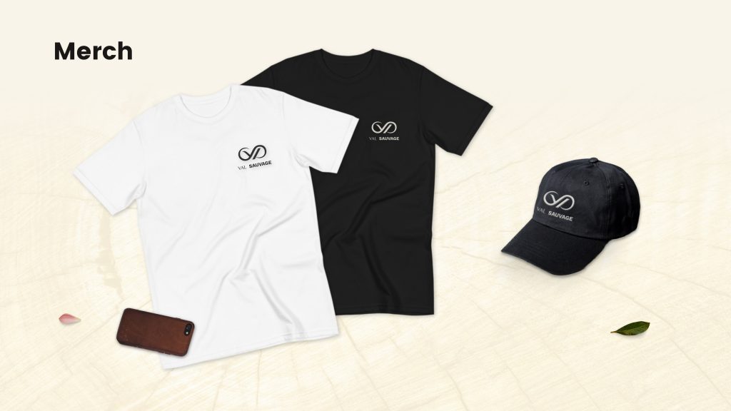
I needed to build my own personal brand from scratch, as a musician, but also as a designer who launched its own clothing brand.
Challenge
This is never easy to work for yourself, as you don’t have the required step back to be critical enough. So I’ve iterated my work a lot and sent it to designer friends to have better feedbacks.
Presenting all my assets in one website was also a tough thing to do (and it still is !), as society tends to prefer more specialized businesses in general.
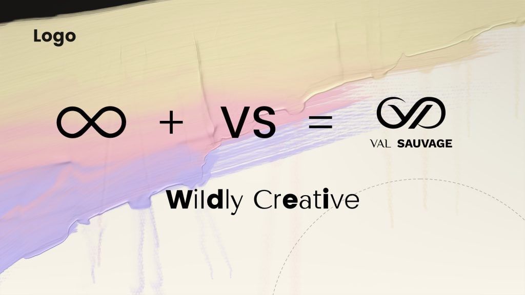
The infinity symbol + The initial letters for Val Sauvage =
An elegant monogram which represents the perpetual movement of my wild creativity.
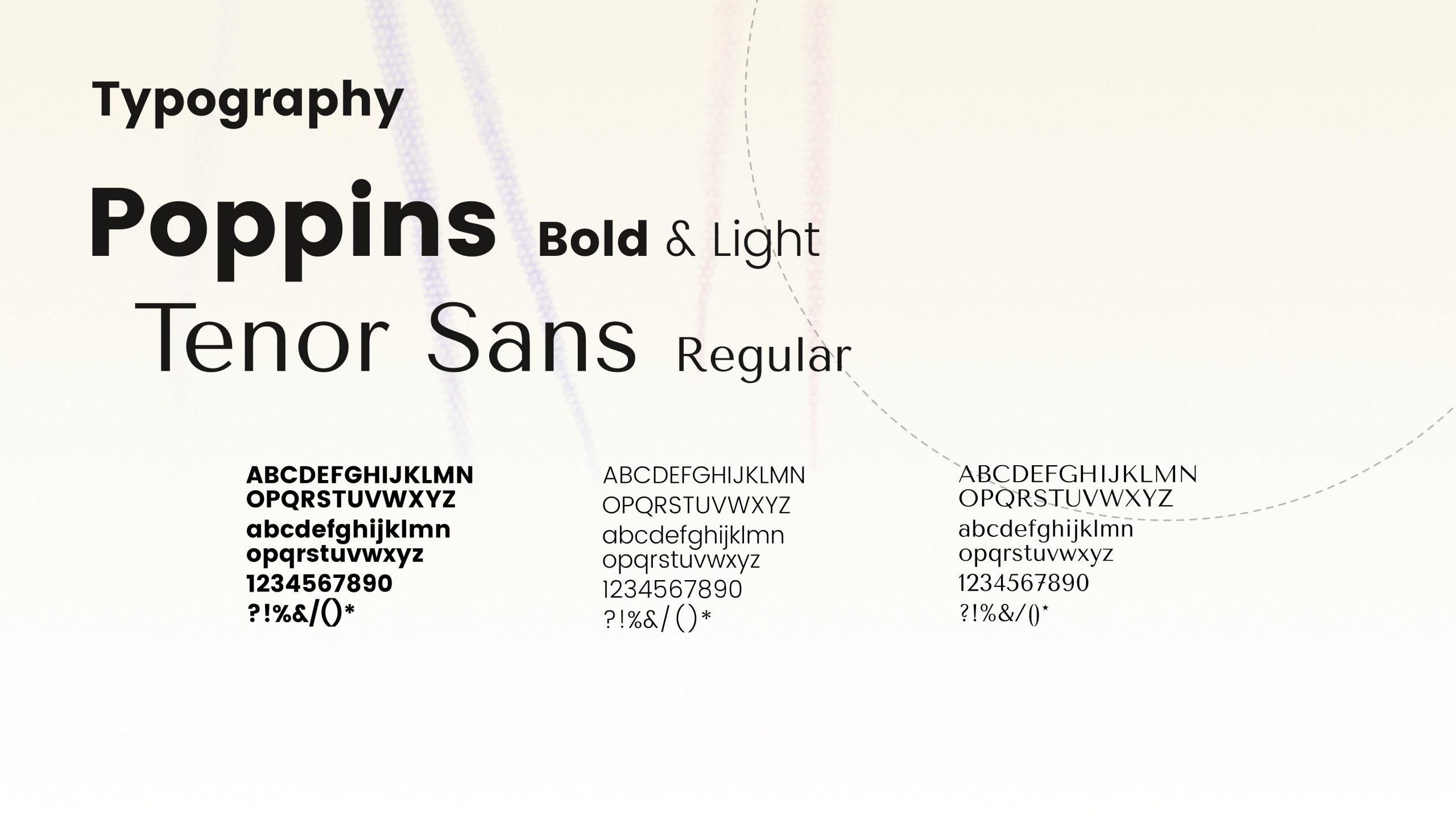
The typography should give a sense of timeless dynamism and modern elegance. That’s why I choosed this fonts combination. Both are really modern though.
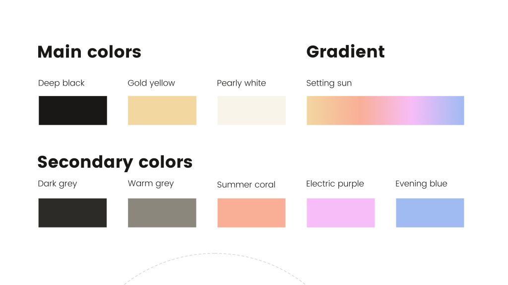
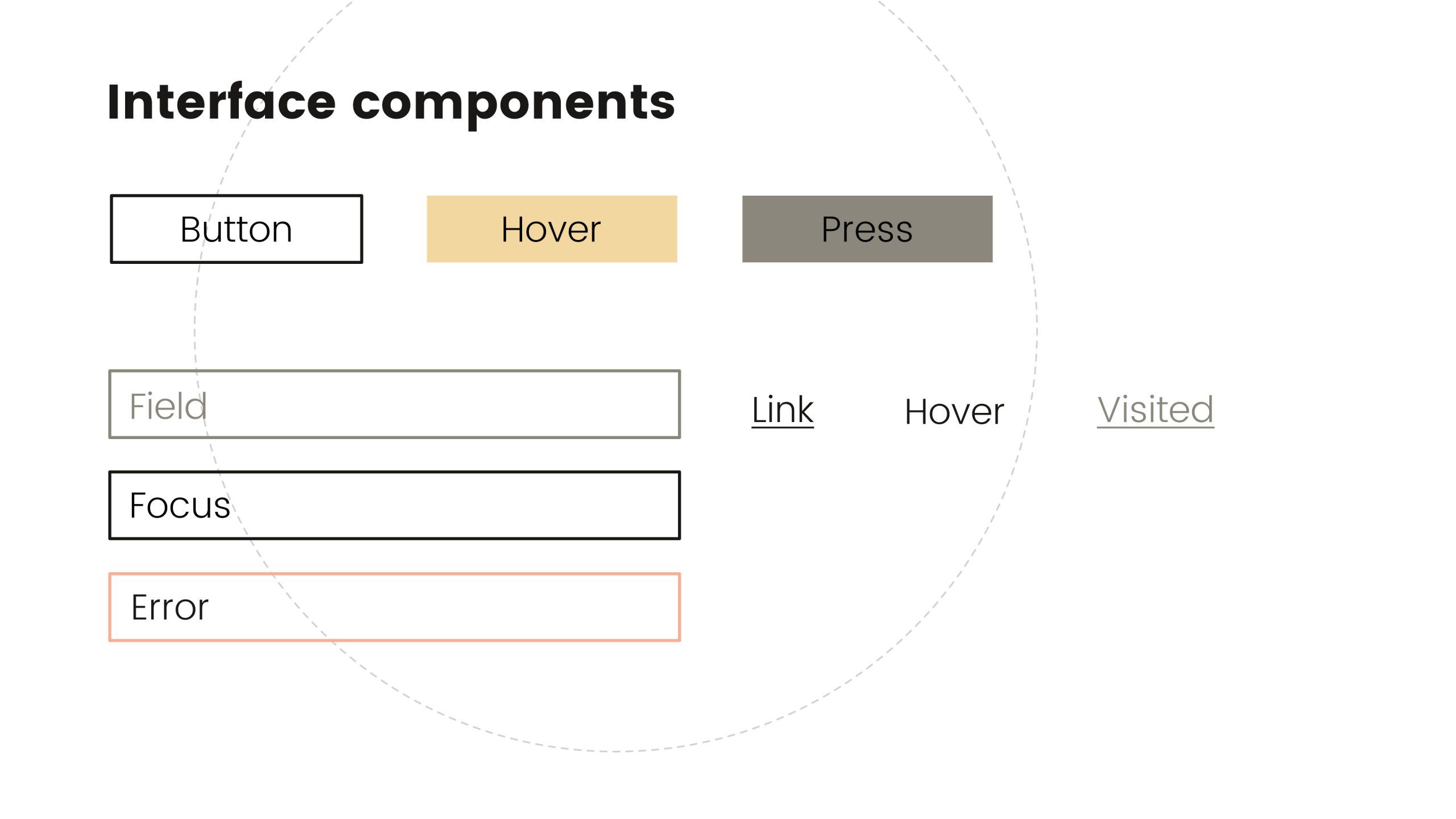
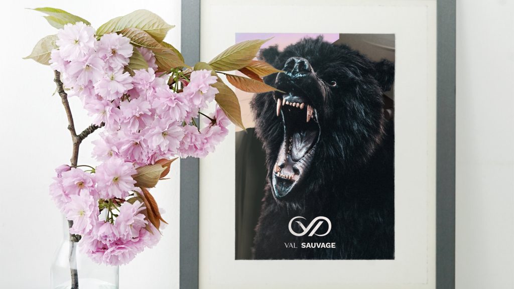
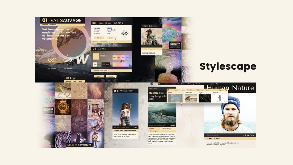
The stylescape is very important as it will lead all the future graphic decisions for the brand. This is a combination of logo, typography, colors, images, textures, interface components, a little bit of competition and the main persona that the business is targetting.
It’s like a much more complex moodboard, and the begining of a true styleguide.
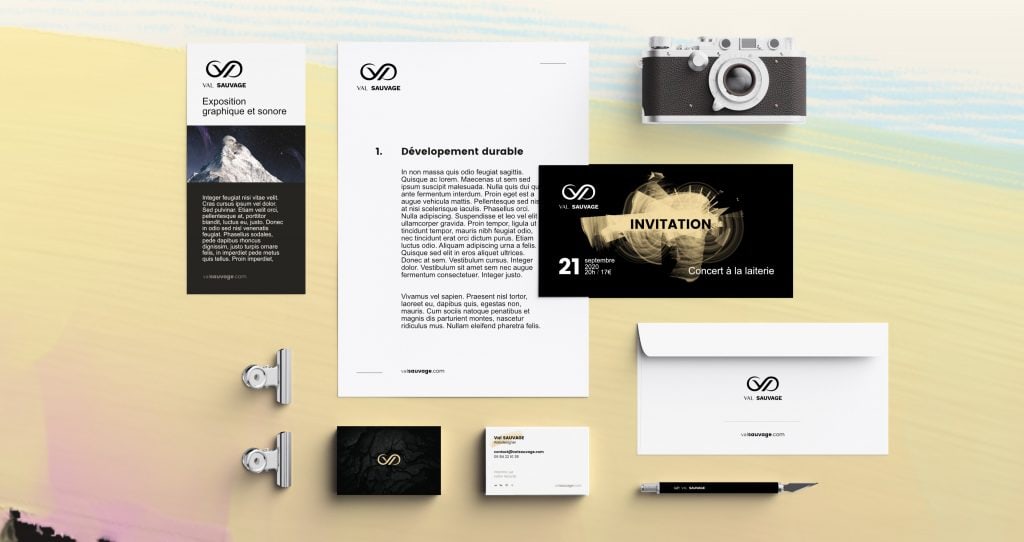
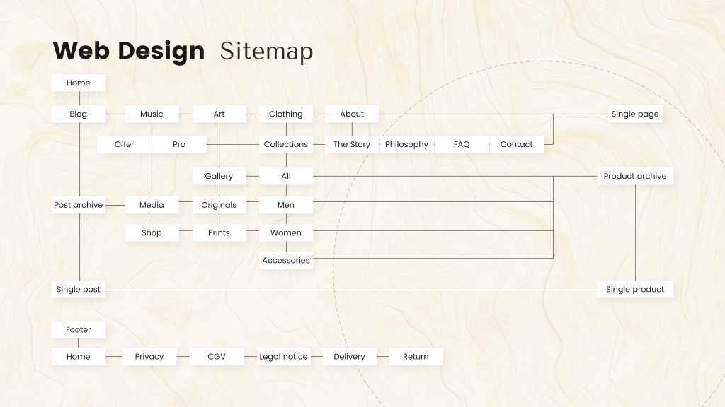
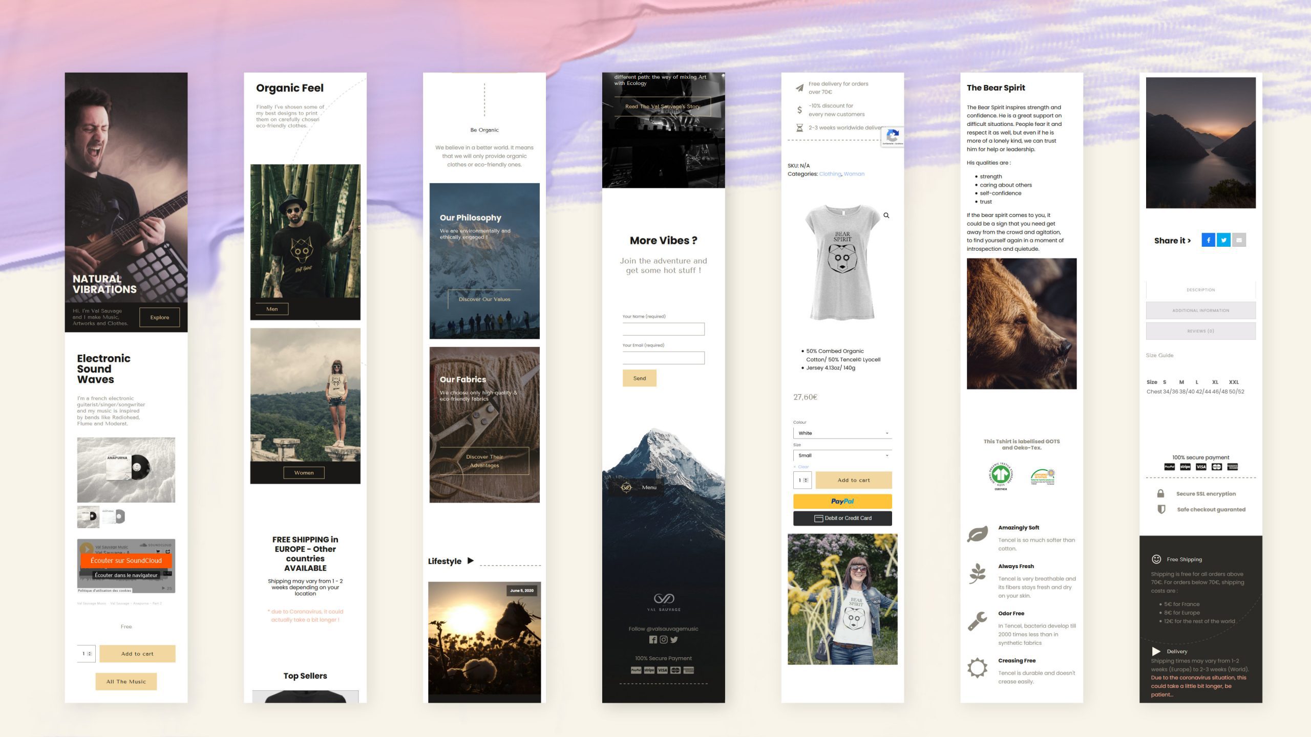
Here is the real deal with my website: presenting all the things I do in a clear and easy to navigate way. The user experience should be seamless and without flaws.
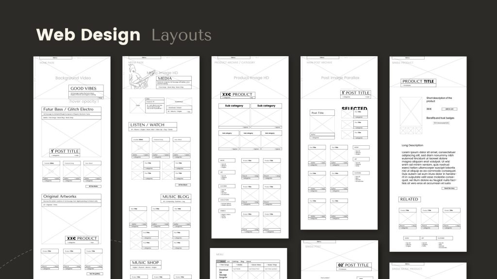
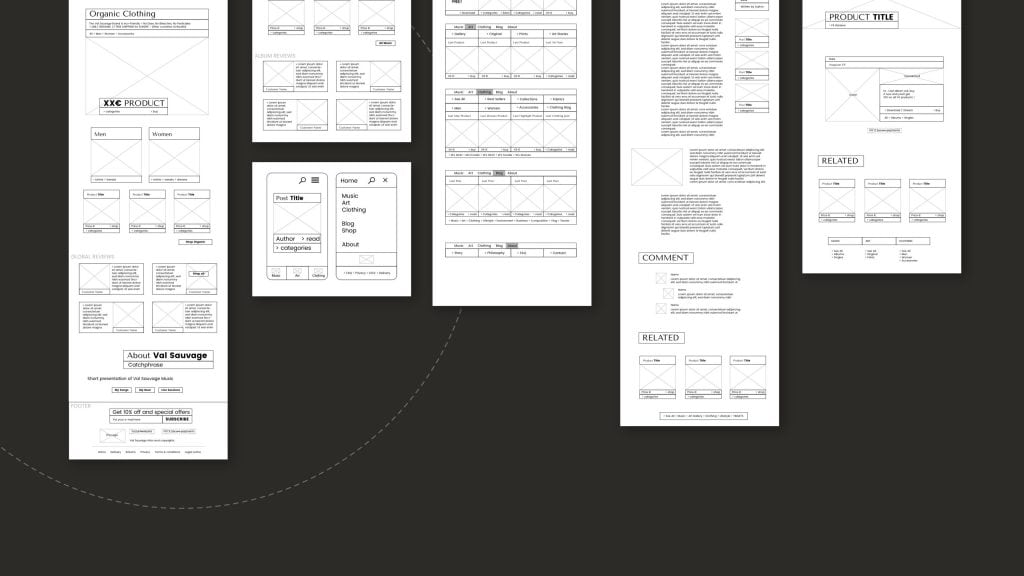
Layouts are defining the different placements of the components on various environments, like the menu, the footer and the mobile design.
This preliminary work is useful to get a better idea of the graphic interface, and it also speeds up the next integration process.
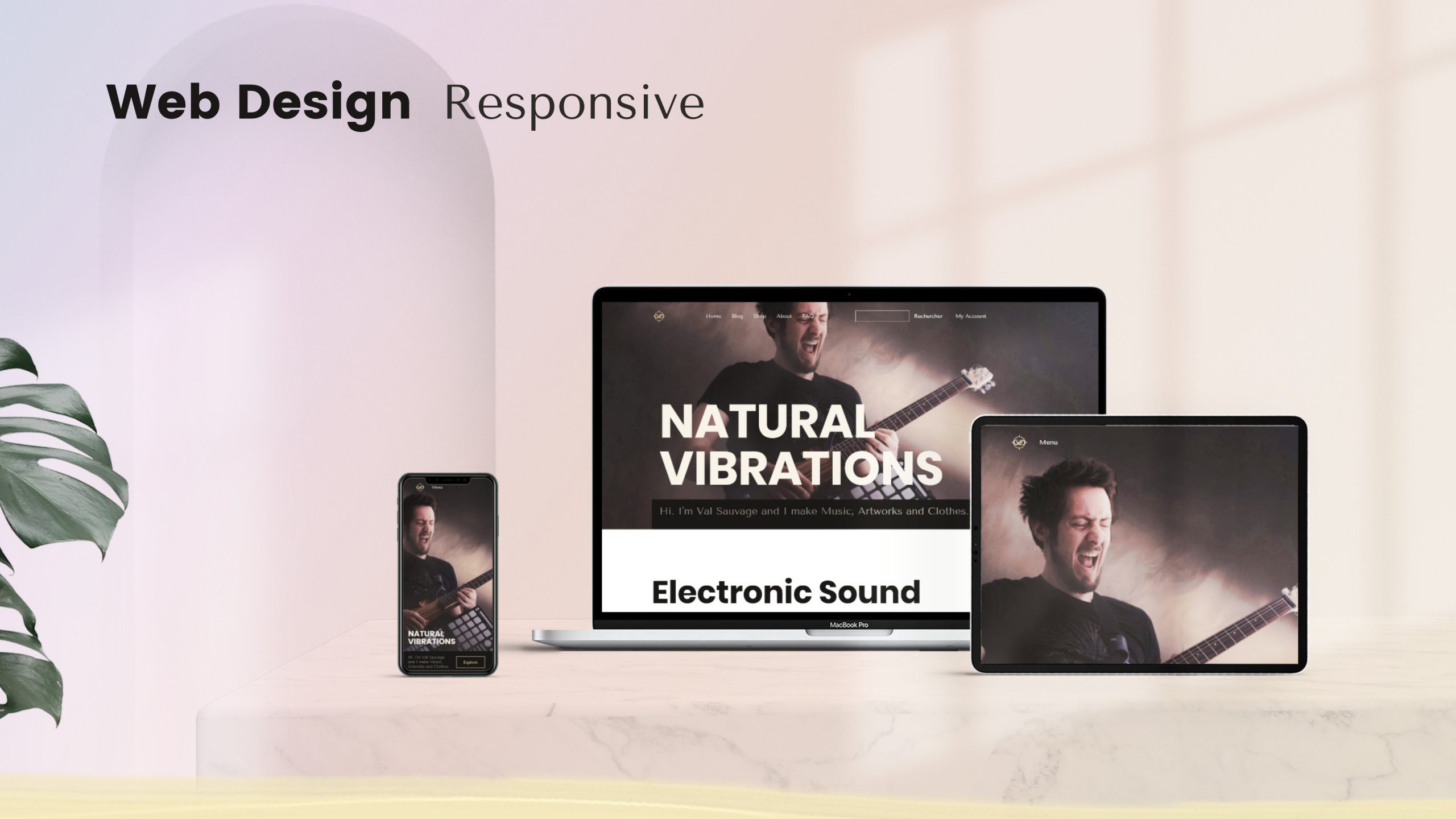
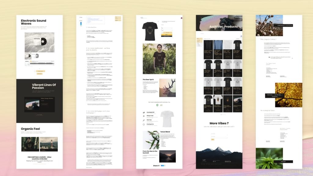
It’s been a truly enjoyable journey to share this with you, I hope it will inspire some of you, let me know what do you think about it !
Also visit valsauvage.com if you wanna see the result.
